Scatter Diagram
Personalize This
Get insights for your role
A scatter diagram plots two variables against each other to reveal relationships, correlations, or patterns between potential causes and effects.
Definition
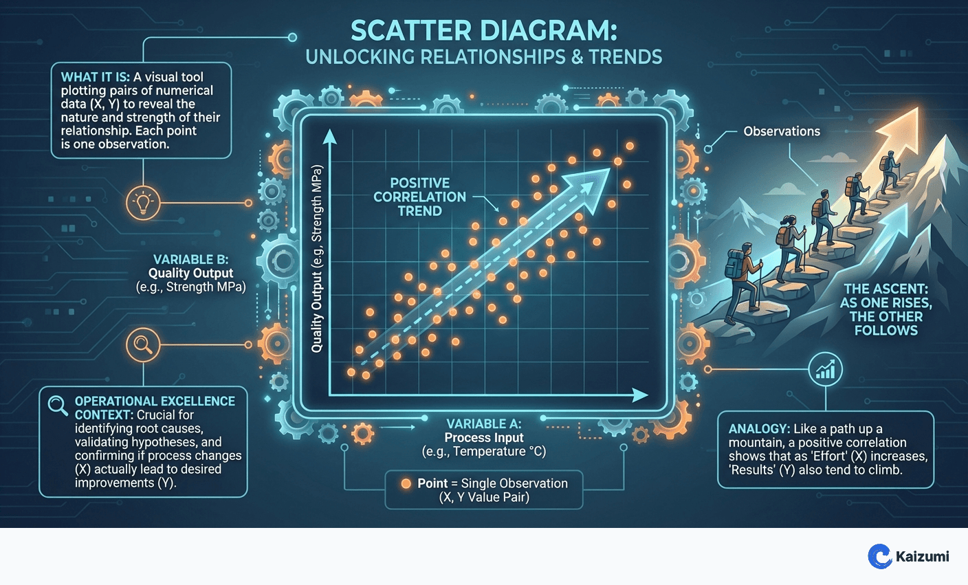
A scatter diagram (also called scatter plot or XY chart) displays the relationship between two variables by plotting data points on a two-dimensional graph. Each point represents a single observation with its X and Y values. The pattern of points reveals whether variables are positively correlated (both increase together), negatively correlated (one increases as the other decreases), or uncorrelated (no pattern). Scatter diagrams are essential in the Analyze phase of DMAIC for validating suspected cause-and-effect relationships.
Examples
A team suspected that ambient temperature affected part dimensions. A scatter diagram plotting temperature (X) against dimension deviation (Y) showed clear positive correlation—dimensions increased with temperature. This validated temperature as a root cause and guided the solution toward environmental controls.
Key Points
- Reveals presence, direction, and strength of relationships between variables
- Positive correlation: points trend upward left to right
- Negative correlation: points trend downward left to right
- No correlation: random scatter with no pattern
- Correlation does not prove causation—further validation needed
Common Misconceptions
Strong correlation proves cause and effect. Correlation indicates relationship, not causation. Two variables might both be caused by a third factor. Designed experiments or process knowledge must confirm causal mechanisms.
Weak correlation means no relationship. Scatter diagrams show linear relationships best. Curved or nonlinear relationships may appear as weak correlation. Consider whether transformations or different analysis methods are needed.