
Value Stream Mapping
Value stream mapping is a lean management method used to analyze and optimize the end-to-end flow of materials and information required to deliver a product or service. By contrasting total lead time with active processing time, it exposes delays, excess inventory, and process bottlenecks across an entire product family. Practitioners visually document the current operational state on a single sheet, measure flow efficiency, and design a future state that establishes continuous flow, balanced workloads, and pull-based production.
- Begin with the customer
- The customer needs 18,400 pieces per month — 920 per working day. Demand sets the pace for the whole map.
- Read information upstream
- Orders and schedules travel from the customer through production control toward the supplier, opposite the material flow below.
- Read the process data
- Each process box records facts such as cycle time, changeover time, and staffing. Stamping takes three seconds but changes over in 45 minutes.
- See inventory as waiting
- The inventory triangles translate stock into time. The four piles hold six, five, three, and two working days — 16 days in total.
- Follow the timeline
- High amber steps are waiting; low blue steps are hands-on work. The timeline exposes how little of the total journey changes the product.
- Compare elapsed time with work
- This family spends 16 working days in the stream for only 104 seconds of processing — a flow efficiency of about 0.012%.
Key facts
- Primary scope
- Single product family end-to-end
- Structural layers
- Information, material, and timeline
- Observation approach
- Reverse gemba walk from shipping to receiving
- Future-state horizon
- 6 to 12 months
- Core comparison
- Total lead time versus active processing time
By Matthew Savas — Founder of Kaizumi. Reviewed 17 August 2026.
Value stream mapping is a lean management method used to document, analyze, and improve the flow of information and materials required to deliver a product or service. By contrasting total lead time with value-creating processing time, it identifies systemic delays, excess inventory, and process imbalances across an entire product family. The method captures both physical operations on the shop floor and the information flows that schedule and control them. Unlike standard process flowcharts that focus on individual tasks, a value stream map captures the end-to-end pathway from raw material delivery through customer fulfillment, providing a single visual representation of how an entire value stream operates.
Purpose and scope
The primary objective of value stream mapping is to expose the systemic causes of lead time delay rather than isolated process inefficiencies. Organizations use the technique to identify non-value-adding activities, establish a baseline of operational performance, and design a future operational state that relies on pull production, balanced workloads, and continuous material flow.
Value stream mapping differs from standard process mapping in several ways:
- Scope: A value stream map typically encompasses the entire fulfillment path for one product family rather than an isolated departmental procedure. A product family consists of items that pass through similar downstream processing steps and share common equipment.
- Single-sheet constraint: The entire end-to-end stream is documented on a single sheet of paper or whiteboard to ensure all stakeholders view system-level interactions simultaneously. Practitioners often start with a Blank map template (PPTX) or use a digital Value stream map builder for long-term documentation.
- Integrated flows: The map explicitly displays the dual relationship between material movement and information scheduling, showing how production control triggers each process.
- Quantitative timeline: The bottom of the map quantifies both production lead time and active processing time, directly establishing the flow efficiency of the system.
For step-by-step drafting instructions, see the guide on how to Draw a map, scene by scene.
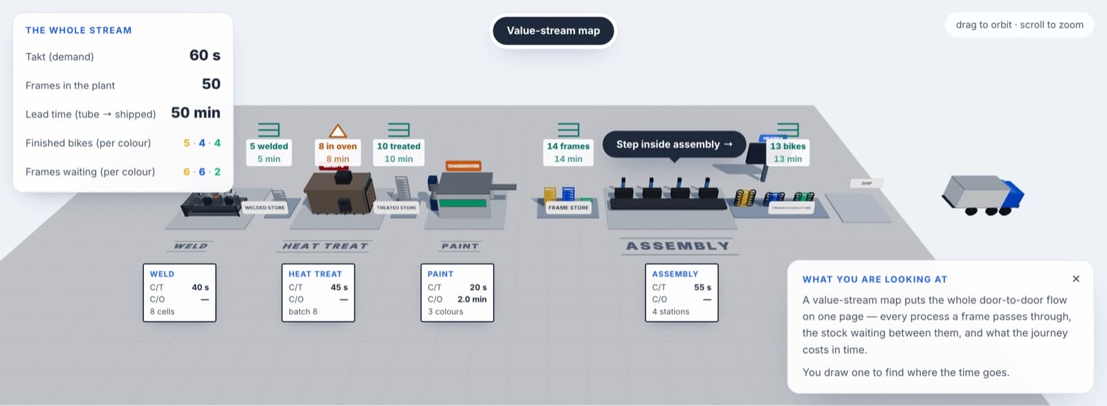
Core components of a value stream map
A standard value stream map integrates three structural layers:
- Information layer: Positioned across the top half of the map, this layer documents how customer demand is received, processed by production planning, and transmitted to suppliers and internal processes. It displays electronic data interchanges, manual forecasts, daily schedules, and pull signals.
- Material layer: Positioned across the middle of the map, this layer documents the physical flow of goods from receiving, through each transformational process step, to final shipping. Each process is represented by a process box accompanied by a data box containing measured operational parameters.
- Timeline layer: Positioned along the bottom of the map, this stepped line records waiting times between processes on the upper segments and active processing times on the lower segments. Summing each segment yields total production lead time and total processing time.
Every process step on the material layer includes a standardized data box. The data box records direct shop-floor observations rather than standard accounting estimates:
- Cycle time: The time interval between completed units emerging from the process step.
- Changeover time: The time required to switch a machine or line from producing the last good piece of one product type to the first good piece of another.
- Uptime: The percentage of scheduled operating time that equipment is available and functioning properly.
- Operators: The number of full-time equivalent personnel dedicated to operating that process step.
- Available working time: The net operating time per shift after subtracting scheduled breaks and planned downtime.
- Batch size: The quantity of parts processed or moved together before progressing to the next stage.
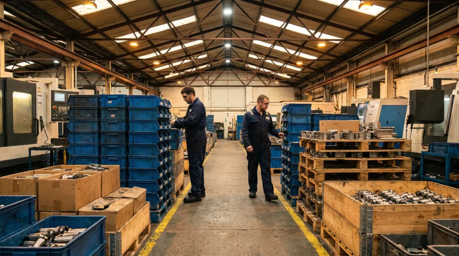
Inventory between process steps is documented using an inventory icon, typically an equilateral triangle containing an exclamation mark or the letter I. The quantity of parts stored in the buffer is recorded directly underneath, along with the calculated days of supply that the inventory represents.
Calculating lead time and flow efficiency
To evaluate the flow of a product family, the map compares total production lead time against total value-creating processing time. Production lead time represents the total time required for a piece of raw material to move through all storage buffers and processing steps to become a finished product.
To convert physical inventory counts into equivalent days of lead time, divide the quantity of units in a buffer by the average daily customer demand. For an in-depth explanation of these metrics, review the guide on Cycle, takt and lead time.
Consider a manufacturing plant producing steel brackets:
- The customer demands 18,400 brackets over 20 working days per month, yielding an average daily demand of 920 units.
- Available operating time is two 8-hour shifts per day, totaling 16 hours or 57,600 gross seconds. Subtracting one 20-minute break in each shift yields 55,200 net available seconds per working day.
- Dividing 55,200 available seconds by 920 units gives a takt time of exactly 60 seconds per piece.
The bracket passes through four sequential processes: stamping, welding, assembly, and packaging. Direct measurements recorded during a floor walkthrough show the following inventory buffers and active processing times:
- Raw material storage holds 5,520 pieces of raw coil stock, which equals 6 days of supply at 920 pieces per day.
- Stamping operates with a cycle time of 12 seconds per piece and a changeover time of 45 minutes. Stamped work-in-process storage holds 4,600 pieces, which equals 5 days of supply.
- Welding operates with a cycle time of 24 seconds per piece. Welded work-in-process storage holds 2,760 pieces, which equals 3 days of supply.
- Assembly operates with a cycle time of 62 seconds per piece.
- Packaging operates with a cycle time of 6 seconds per piece. Finished goods storage holds 1,840 completed brackets, which equals 2 days of supply.
Summing the inventory storage times across the timeline layer yields total lead time: 6 days in raw materials, plus 5 days after stamping, plus 3 days after welding, plus 2 days in finished goods, for a total lead time of 16 working days. Over those 16 days, the total work-in-process across the facility stands at 14,720 units.
Summing the active processing times across all four operational steps yields total processing time: 12 seconds in stamping, plus 24 seconds in welding, plus 62 seconds in assembly, plus 6 seconds in packaging, for a total work time of 104 seconds.
To calculate flow efficiency, convert total lead time into seconds. Operating 16 working days is equivalent to 883,200 seconds of plant operating time (16 multiplied by 55,200). Dividing 104 seconds of active processing time by 883,200 seconds of total lead time, and multiplying by 100, yields a flow efficiency of 0.012%.
This ratio demonstrates that a part receives active processing for only one out of every 8,492 seconds it spends inside the facility. The remaining time is spent waiting in stationary inventory batches. The reasons why large production lots create these extended queues are examined in the guide on Why batches stretch lead time.
Try it yourself
Current state versus future state design
Value stream mapping is an iterative, two-phase process:
- Current-state map: Captures the operational reality of the shop floor as it exists today, establishing the baseline lead time, inventory accumulation points, and scheduling mechanisms.
- Future-state map: Defines how the value stream should function over a target horizon of six to twelve months once structural lean principles are implemented.
The transition from current state to future state relies on specific lean design questions:
- What is the takt time based on actual customer demand rates?
- Can finished goods be shipped directly from continuous flow, or is a finished-goods supermarket required?
- Where can continuous processing flow be introduced to eliminate intermediate storage buffers?
- Where continuous flow is not possible, can FIFO lanes or pull supermarket systems replace push scheduling?
- Which single process step will act as the pacemaker process to control the production pace for the entire upstream stream?
- How will the production mix and volume be leveled at the pacemaker process?
In the steel bracket example, the future-state design introduces targeted structural changes:
- Raw material delivery: Implementing a daily milk run reduces incoming raw coil stock from 6 days to 2 days of supply.
- Setup reduction: Executing a Single-Minute Exchange of Die project reduces stamping changeover time from 45 minutes to 9 minutes, enabling smaller batch sizes and reducing stamped inventory from 5 days to 1.5 days.
- Process coupling: Replacing the unconstrained welded buffer with a capped FIFO lane reduces intermediate inventory from 3 days to 0.1 days.
- Finished goods replenishment: Implementing a finished-goods supermarket allows shipping to pull directly against customer demand, reducing finished stock from 2 days to 1 day.
- Line balancing: Rebalancing assembly tasks reduces its cycle time from 62 seconds to 58 seconds, bringing it below the 60-second takt time and stabilizing throughput.
Under this future state, total lead time drops from 16 days to 4.6 days, a 71 percent reduction, while total inventory falls from 14,720 units to 4,232 units. Value-creating work time changes only marginally (from 104 seconds to 100 seconds), shifting flow efficiency from 0.012% to 0.039%. The organization executes these improvements through a structured kaizen event plan.
Application in non-manufacturing environments
While value stream mapping originated in manufacturing, its structural principles apply equally to administrative, transactional, and service processes. In transactional environments, material flow is replaced by the movement of digital files, requests, or physical paperwork, while physical inventory is replaced by backlogs, shared inboxes, and awaiting-approval queues.
Mapping these streams requires two key methodological adaptations:
- Redefining units of work: Items in process are tracked as discrete claims, tickets, orders, or patient visits rather than physical parts.
- Accounting for knowledge work variability: Information tasks often exhibit wide variance in processing duration, requiring practitioners to measure both median task time and total queue delay between handoffs.
In the financial and insurance sectors, teams apply these methods to eliminate handoff delays and reduce policy underwriting or claims settlement durations. Specific approaches for these environments are detailed in the guide on Mapping a claims stream. For example, an insurance claims review process might require 2 hours of active analysis spread across an 11-day overall processing window (equivalent to 88 operating hours), resulting in a flow efficiency of 2.3%.
In clinical healthcare systems, value stream maps follow the patient pathway through triage, diagnostics, clinical review, and discharge to reduce emergency department crowding and surgical prep delays. Practical healthcare applications are covered in the guide on Mapping a hospital stream.
Implementation practice and execution
Developing a value stream map requires direct observation on the gemba rather than reliance on computerized enterprise resource planning reports or engineering specifications. The mapping team walks the entire physical pathway in reverse, starting at the shipping dock and moving upstream toward receiving. Walking backwards ensures the team views the system from the customer perspective, observing how downstream demands pull from upstream suppliers.
During the walkthrough, practitioners record actual inventory counts, interview operators regarding changeover procedures and interruptions, and use stopwatches to time process cycles. Once the current state is documented and verified with operational teams, the future state is designed and broken down into actionable improvement loops.
To explore how these material and information connections interact dynamically inside an operational production environment, see the interactive simulation The plant, running.
Frequently asked questions
- How does value stream mapping differ from standard process mapping?
- Value stream mapping evaluates the end-to-end fulfillment path of an entire product family rather than an isolated departmental procedure. It captures both physical material handling and the information flows that schedule production together on a single sheet. Unlike standard flowcharts, a value stream map also includes a timeline along the bottom that measures production lead time against active processing time.
- What are the core structural layers shown on a value stream map?
- A standard value stream map integrates three horizontal sections: an information layer, a material layer, and a timeline layer. The information layer across the top displays how customer demand and production control schedule internal steps and suppliers. The material layer across the middle documents operational steps, process data boxes, and inventory buffers, while the bottom timeline compares waiting times against active processing times.
- How is flow efficiency calculated on a value stream map?
- Flow efficiency is calculated by dividing total active processing time by total production lead time and multiplying by 100. Both measures must use the same unit of time, which requires converting inventory buffer quantities into net operating seconds based on daily customer demand. The resulting percentage reveals how much of the total lead time is spent actively adding value versus waiting in storage queues.
- Why do mapping teams walk the process pathway in reverse when gathering data?
- Practitioners walk the gemba backward from the shipping dock toward receiving to view the operational sequence from the perspective of the customer. Moving upstream reveals how downstream operations pull work from preceding stations rather than how parts are pushed through. This orientation helps the team observe actual inventory accumulation, batch sizes, and scheduling disconnects at each handover point.
- How is value stream mapping applied to service and administrative processes?
- In transactional environments, the material layer is adapted to track the flow of digital files, requests, or paperwork, while physical inventory is replaced by queues like shared inboxes and backlogs. Items in process are measured as discrete units such as claims, tickets, or patient visits rather than manufactured parts. Because knowledge work duration varies, practitioners record both median task times and waiting durations between handoffs.