
The Spaghetti Diagram
Trace the path a worker actually walks, and the waste jumps off the page. Below is one shift in a fabrication cell — walk it, then drag the machines to untangle it.
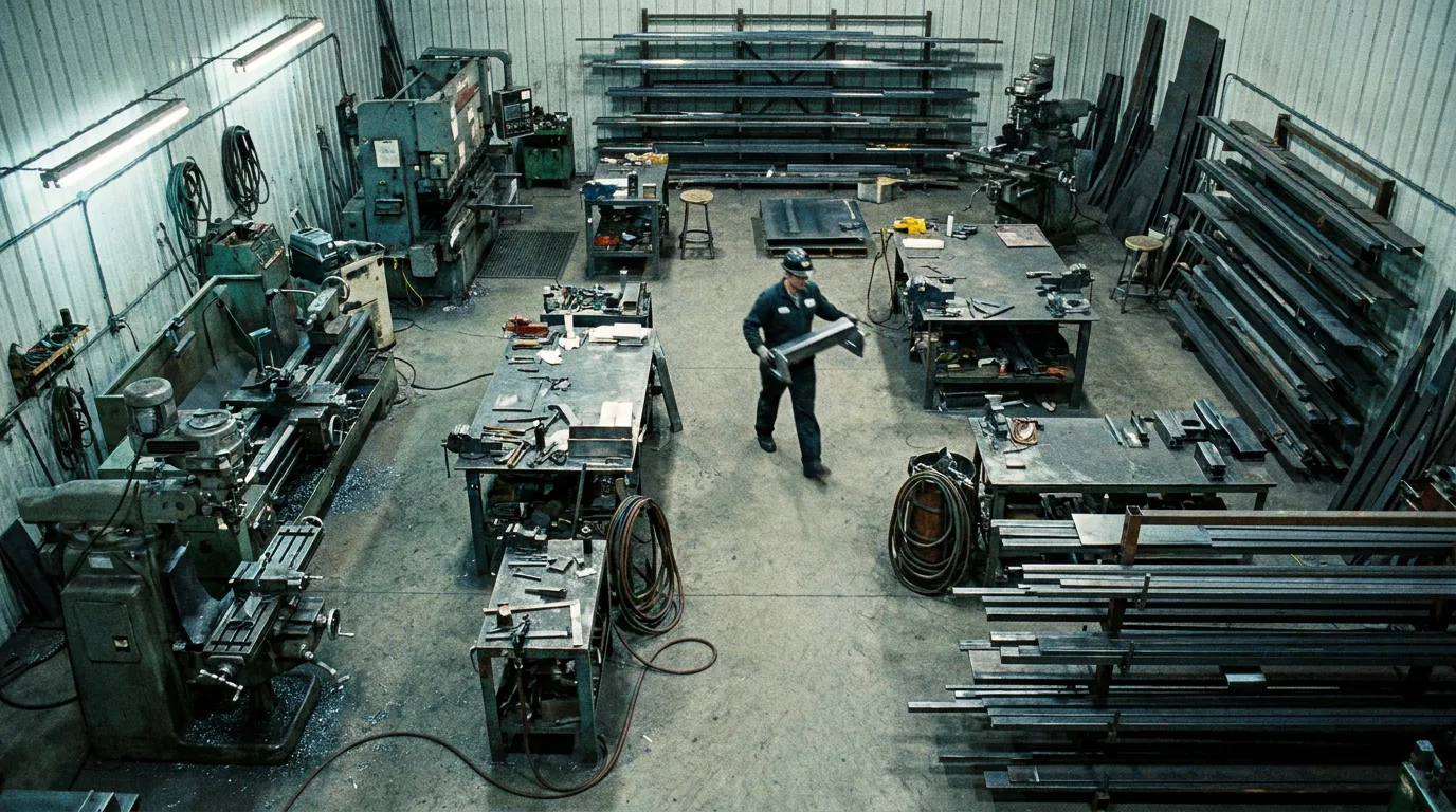
Walk it, then untangle it
A spaghetti diagram traces the path someone actually walks. Pick a setting, press “Walk it,” then drag the stations into a sensible flow and watch the distance fall — same work, far less walking. The waste isn’t only on factory floors.
The work at each machine doesn’t change — only the walking between them. That walking is pure motion waste, and layout is the only thing that fixes it.
How to run one for real
Pick one subject
One operator, or one part. Don’t mix — a diagram that tracks everything tracks nothing.
Stand and follow
Watch a full cycle at the gemba and draw every move as one continuous line on a floor plan.
Measure it
Total the distance (a pedometer or map scale works). Multiply by the day’s volume — the number shocks people.
Redesign the flow
Move the stations so consecutive steps are adjacent — usually a U-shaped cell. Re-draw, re-measure, repeat.
Frequently asked
- What is a spaghetti diagram?
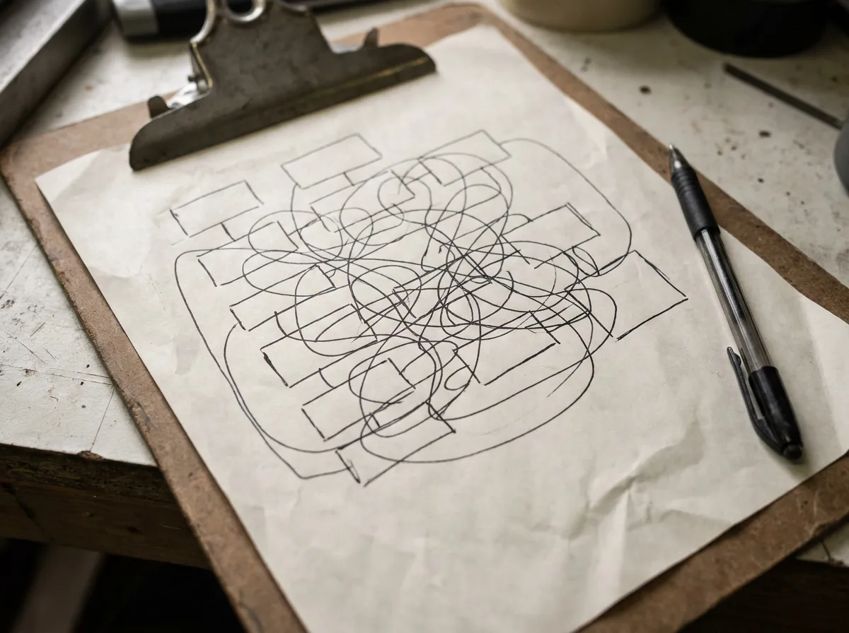
- A spaghetti diagram is a simple map of the physical path a person or product travels through a workspace, drawn as one continuous line on a floor plan. The tangled, noodle-like result makes wasted motion and transport visible at a glance, so you can redesign the layout to shorten the path.
- What waste does it reveal?
- Chiefly motion (people walking) and transport (moving materials) — two of the seven wastes. Long or crossing lines mean the layout is forcing travel that adds no value. The work at each station is unchanged; only the distance between them is the target.
- How do you measure the distance?
- Trace the path to scale on a floor plan and total the segment lengths, or walk it with a pedometer. Then multiply by the daily volume — a modest per-cycle distance becomes kilometres per shift, which is what makes the case for change.
- How do you fix a bad one?
- Rearrange the stations so steps that happen in sequence sit next to each other — often a U-shaped cell where material enters and finished parts leave at the same end. Re-draw the diagram after each change to confirm the path actually shrank.