
A value stream map in healthcare follows one patient down one path — emergency arrival to discharge, or referral to first appointment — through every step, queue, and handoff along the way. The point isn't a tidy diagram on the breakroom wall; it's a number that lands hard: how little of that elapsed time the patient is actually being cared for. Most of it is waiting — in a bed, in a hallway, in a worklist, for a result, for a bed upstairs. This guide shows how to map a patient journey end to end, what to record at each step, the quality metric a factory map leaves out, the math on a worked example, and the future-state moves that take hours out of the journey. You'll finish able to map one patient stream this week and see exactly where your lead time hides.
Why value stream mapping is different in healthcare
Almost everything written about VSM maps a factory: steel through presses, parts stacking between machines. A patient journey breaks that mental model, and copy-pasted factory VSM stalls because of it.
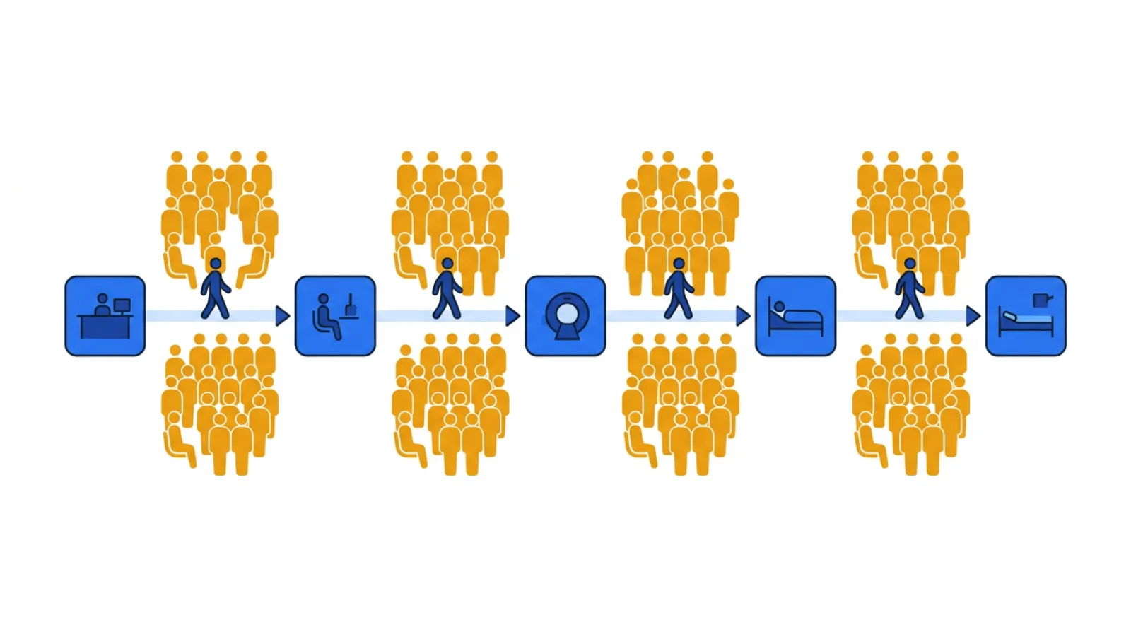 A patient journey: small care steps, big waits between them.
The one-line test for every box on the map: is the patient being cared for, or is the patient waiting? In healthcare the honest answer is "waiting" — by a landslide — and that's where your lead time is hiding.
A few things make a patient journey its own animal:
- There's no material — you map a patient and the information about them. The "product" is a person moving through triage, beds, imaging, labs, consults, and discharge — and a parallel stream of orders, results, and notes that has to keep pace. You can't see the journey pile up on a floor the way work-in-process stacks up on a line, which is exactly why the waiting stays invisible until you draw it.
- The dominant waste is waiting, not motion. A patient boarding in the ED because there's no inpatient bed, a discharge held until a consult signs off, a result sitting unread for an hour — that's the muda you're hunting. It's quiet, it's everywhere, and it rarely shows up in anyone's productivity report.
- Rework is a hidden tax on safety, not just speed. A patient who arrives at the next step with a missing order, an unlabeled specimen, or an incomplete handoff gets bounced back — a redraw, a repeat scan, a clarifying page. Factory VSM tracks machine uptime; healthcare VSM has to track percent complete & accurate (%C&A) — did the work arrive good enough for the next clinician to act on without sending it back?
- The headline metric is flow efficiency. Every patient stream you map tends to produce the same gut-punch: the patient spends almost all of the journey waiting. A four-hour ED stay might contain only twenty or so minutes of hands-on care. That ratio — value-add time over lead time — usually lands in the low double digits or worse, and it's the number that changes the conversation. (Flow efficiency just means how much of the elapsed time is actual care versus waiting.)
So the goal isn't to make nurses chart faster or push clinicians to "see one more." Borrowing the Toyota lens: efficiency is the consequence, not the goal. You attack the queues and the rework loops, and shorter waits, safer care, and a calmer department follow. Fix the system, not the staff.
Run the numbers on a journey of your own before reading on, then come back.
What a value stream map of a patient journey actually captures
A factory VSM records cycle time and machine uptime. A patient map keeps the boxes but changes what goes in the data box under each step. Here's what to capture as you walk the journey at the gemba — beside the patient, not from a conference room.
1Value-add time — cycle time: the few minutes of real care
For each step, record the hands-on time — how long the clinical task takes once someone actually starts it. A triage assessment might be 8 minutes; a physician exam, 15; drawing labs, 5. This is almost always small, and that's the point: value-add time is the number you'll compare everything else against. Be ruthless about what counts as value-add — only the steps the patient would gladly pay for and that move care forward. Charting that exists only because the last handoff was incomplete is not value-add.
2Wait time: where the hours actually go
Between every step is a queue — the time the patient waits before the next thing happens. Record it honestly: 40 minutes from arrival to triage, 90 minutes from triage to a room, 3 hours boarding for an inpatient bed. On most patient maps the sum of wait times dwarfs the sum of value-add times by several times over — and once boarding enters the picture, the gap only widens. Waiting is the waste you're really hunting; the care itself is rarely the problem.
3Percent complete & accurate (%C&A): the rework loop you can't see
At each step, ask the clinicians downstream: what fraction of the time does the patient arrive with everything needed to proceed — orders in, results back, specimen labeled, handoff complete — without sending anything back? That's %C&A. A 75% handoff from the ED to the floor means one in four patients arrives missing something, triggering a page, a clarification, a redo. Multiply %C&A across every step and you get the first-pass yield of the whole journey — usually a sobering number, and a safety signal as much as a speed one.
4Queue size — the patients waiting between steps
Note how many patients are stacked in front of each step: the waiting room at triage, the boarders waiting for a bed, the worklist of scans waiting to be read. A queue that keeps growing marks your bottleneck — the step that sets the pace of the entire journey, exactly as the slowest machine paces a line. Big queues are where you look first.
5Demand and takt time: the pace the journey has to hold
Count how many patients arrive per day for this stream. Divide your available staffed time by that demand and you have takt time — the pace care has to sustain to keep up. If 72 patients arrive across a 12-hour staffed window, takt is one patient every 10 minutes; any step that can't release a patient that often will grow a queue in front of it. Takt turns "we're slammed" into a number you can design against.
How to run your first patient value stream map (step-by-step)
Pick one patient stream — one journey, end to end — not the whole department. The ED path for a low-acuity patient (arrival → triage → room → workup → disposition → discharge), or a clinic referral (referral received → scheduled → seen), is a good first map.
- Pick the stream and its endpoints. Name where it starts (patient arrives, referral received) and ends (discharged, or first appointment complete). One patient population, one map.
- Walk it at the gemba. Follow a real patient through the journey alongside the people who touch it — registration, triage nurse, physician, tech, case manager. Don't map from the protocol binder; map what actually happens, including the workarounds and the "we always have to call upstairs" steps.
- Draw the current state. A box per step, a data box under each (value-add time, wait time, %C&A, queue size), and the queues drawn between them. Sketch the rework loops right on the map — the arrows where a patient or order bounces back upstream for a missing result, an incomplete handoff, a clarification. Those loops are usually where the lead time is hiding.
- Add the timeline and do the math. Lay value-add time and wait time on a stair-step line at the bottom. Sum each. Total value-add over total lead time is your flow efficiency — the headline number.
- Find the waiting and the rework. Mark the biggest queues and the lowest %C&A steps. These are your targets — not the busiest staff.
- Design a future state. Where can you remove a handoff, fix accuracy at the source with a poka-yoke (a simple safeguard that makes the error impossible — for example, a room can't be marked ready until the order set is attached), pull the next patient instead of pushing, or level the arrivals? Draw it, then pick the first kaizen (one small, concrete improvement) and name an owner.
A worked example: a low-acuity ED journey
Here's how a first map tends to look. The numbers are an honest hypothetical — the shape is what you'll actually find.
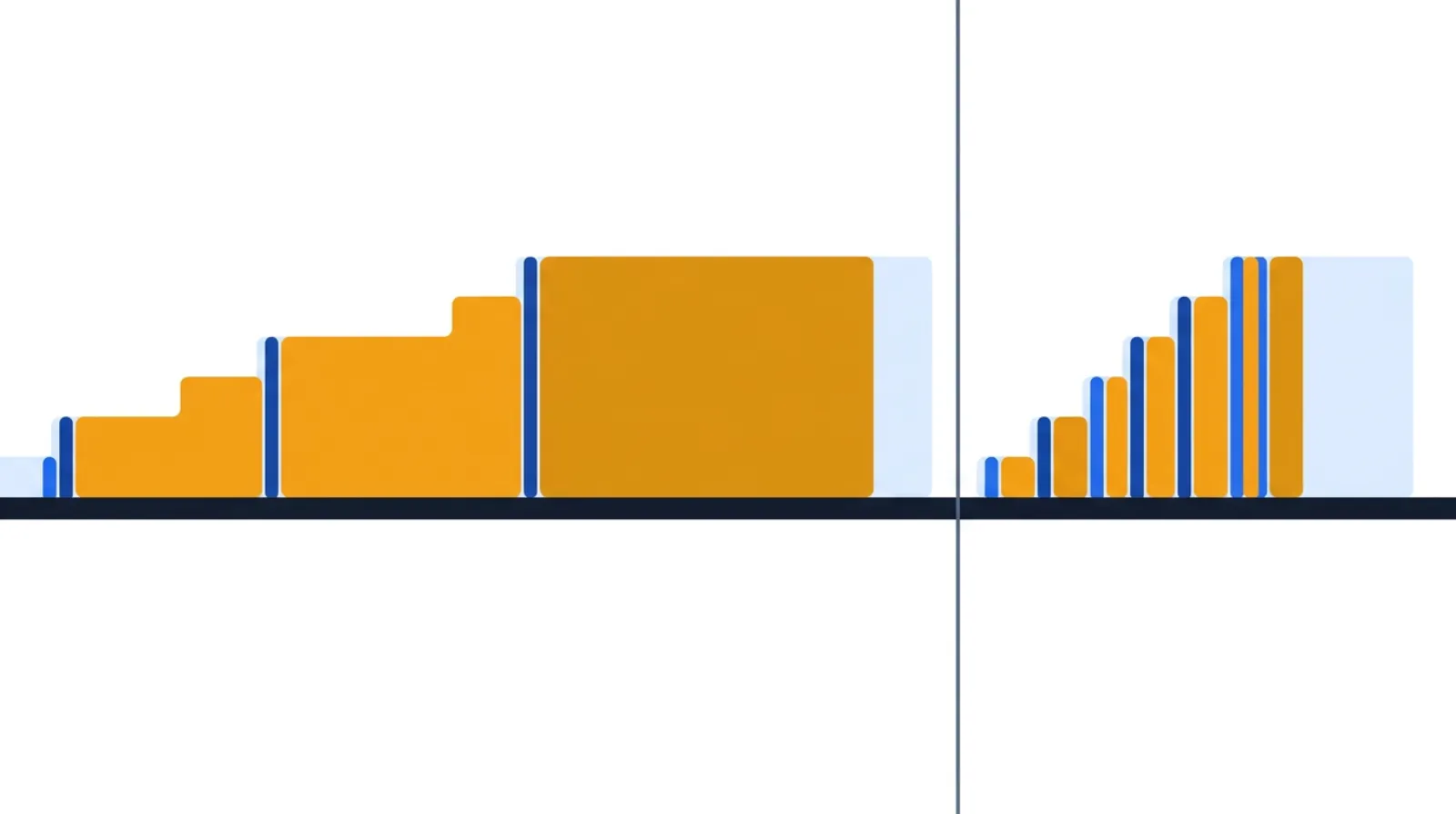
You walk one low-acuity patient from arrival to discharge and record each step:
| Step | Value-add time | Wait before step | %C&A |
|---|---|---|---|
| Arrival & registration | 5 min | — | 90% |
| Triage assessment | 8 min | 40 min | 85% |
| Placed in room / roomed | 5 min | 90 min | 80% |
| Physician exam & orders | 15 min | 25 min | 90% |
| Labs & imaging (drawn → resulted) | 20 min | 120 min | 85% |
| Disposition & discharge | 12 min | 60 min | 95% |
Add it up: about 65 minutes of real, hands-on care (5 + 8 + 5 + 15 + 20 + 12) spread across roughly 6 hours and 40 minutes of elapsed time (65 minutes of care plus 335 minutes of waiting). That's a flow efficiency near 16% — and for a low-acuity patient with no boarding, that's actually a good day; add a 3-hour wait for an inpatient bed and it collapses below 10%, which is the more common reality. Meanwhile the rolled first-pass yield (0.90 × 0.85 × 0.80 × 0.90 × 0.85 × 0.95) is around 45% — fewer than half of these patients travel the journey clean; the rest trigger a page, a re-draw, or a clarification somewhere along the way.
Read that map and the targets jump out, and none of them is "see patients faster." The 120-minute wait for labs and imaging is the bottleneck — and the 80% "roomed" %C&A feeding it (rooms held without orders in, specimens mislabeled) is the rework loop swelling that queue. Put that safeguard in place — the room can't be flagged ready until the orders are attached — and you stop manufacturing the bounce-backs. The hours come out of the waiting and the rework, not out of the people. Get one patient to flow one at a time — pulled to the next open step instead of batched and pushed — and the timeline collapses while the actual care content barely changes.
Now build your own map — drop in your steps, set each one's value-add and wait time, and the tool draws the timeline and calculates flow efficiency for you, current state first, then a future state:
A quick patient-flow health check
You don't redraw the whole map every month. Walk the journey and answer five questions:
- Flow efficiency: Do you know your value-add-to-lead-time ratio for this stream, and is it trending up?
- The big wait: Which step has the longest queue in front of it, and is it shrinking?
- %C&A at the handoffs: Are patients and their orders arriving complete and accurate, or still feeding rework downstream?
- Handoffs: How many times does the patient change hands, units, or systems — and have you removed any?
- Pace vs. takt: Is the stream keeping up with arrivals, or is the waiting room (or the boarding count) growing?
Build and share the map itself — current and future state, with the timeline math done for you — using the free value stream map tool.
Common healthcare VSM mistakes
- Mapping the protocol, not the patient. The pathway in the binder is the official story. The gemba — how a patient actually moves, with every "we always have to wait on…" — is the real one. Walk it with a real patient and map reality.
- Chasing value-add time. Shaving two minutes off a 15-minute exam is rounding error against a 90-minute wait for a room. Attack the waiting.
- Skipping %C&A. A map without complete-and-accurate data hides the rework loops — the missing orders, the incomplete handoffs — that cause most of the delay and most of the safety risk. It's the metric clinical VSM most often drops and most needs.
- Mapping every patient type at once. One stream, end to end, beats a tangled map of the whole department. Pick the highest-volume or most painful journey first.
- Blaming the staff for the system's waiting. The waits live between the boxes — in beds, hallways, and worklists — not inside the clinicians. A future state that just tells people to hurry isn't a future state.
- A future-state map with no kaizen behind it. A beautiful future state nobody is assigned to build is wall art. End with one improvement and an owner.
Templates & tools
- Free value stream map tool — build current- and future-state patient-journey maps, with value-add/wait time and the flow-efficiency math handled for you. No login required.
- Spaghetti diagram — trace how a single patient (or a specimen) physically travels through the department; a strong companion to the VSM for surfacing transport waste.
- Related guides: How to Run a Value Stream Map in Insurance for the same flow-efficiency lens on a transactional stream, and How to Use Takt Time in Manufacturing for the demand-pace math behind takt.
FAQ
What is value stream mapping in healthcare? It's following one patient journey — say, ED arrival to discharge, or referral to first appointment — through every step, queue, and handoff, recording value-add time, wait time, and percent complete & accurate at each step. The map exposes how little of the elapsed time the patient is actually being cared for, and where the waiting and rework hide.
What's the difference between mapping a factory and mapping a patient journey? A factory map follows material through machines and tracks cycle time and uptime. A healthcare map follows a patient — and the orders, results, and notes that travel with them — and tracks wait time and percent complete & accurate. The dominant waste shifts from work-in-process inventory to patients waiting in beds, hallways, and worklists.
What is flow efficiency in a patient journey? Flow efficiency is total value-add (hands-on care) time divided by total lead (elapsed) time. In healthcare it commonly lands in the low double digits — and dips into the single digits once patients board for a bed — meaning the patient spends the overwhelming majority of the visit waiting, not being cared for. Raising it is mostly about removing queues and rework, not speeding up clinicians.
What is %C&A and why does it matter in healthcare? Percent complete & accurate is the share of the time work arrives at a step good enough to act on without sending it back — orders in, results back, handoff complete. Low %C&A creates rework loops (pages, redraws, repeat scans) that add delay and, more importantly, create safety risk. It's the quality metric clinical VSM lives on.
Which patient stream should I map first? Pick one journey, end to end — the highest-volume or most painful one, like the low-acuity ED path or a single clinic referral. One stream mapped deeply beats every stream mapped shallowly.
Related concepts & guides
- Dictionary: Value Stream Mapping · Value Stream · Cycle Time · Takt Time · First-Pass Yield · Bottleneck Analysis · Pull System · Muda · Poka-Yoke
- Guides: How to Run a Value Stream Map in Insurance · How to Use Takt Time in Manufacturing
Sources
- Lean Enterprise Institute, Lean Lexicon: Value-Stream Mapping
- Institute for Healthcare Improvement, Going Lean in Health Care (IHI White Paper)